Inspiring musicians through a digital community
Playing an instrument as an adult can be challenging. No matter how much you love music, it can be difficult to find the time to dedicate to your craft.
For this speculative project, I conducted research to better understand what adults value in their experience of learning and playing music and designed a solution to meet those needs.
This case study will provide an overview of my user-centered design process as I research and understand the users, define their key pain points, and use my findings to design, test, and iterate on the best solution to those problems
COMPETITIVE ANALYSIS:
There are various products that support musical learning. However, none of the competition focus on motivating users through a sense of community. Since music is so rooted in social expression, I assumed that users would value more of a community experience. So I decided to test that assumption.
There are various products that support musical learning. However, none of the competition focus on motivating users through a sense of community. Since music is so rooted in social expression, I assumed that users would value more of a community experience. So I decided to test that assumption.
USER INTERVIEWS:
To gain a better understanding of what individuals value in their music learning journey, I conducted six user interviews. These conversations centered around users' experience of either mastering a new instrument or improving their existing knowledge.
To gain a better understanding of what individuals value in their music learning journey, I conducted six user interviews. These conversations centered around users' experience of either mastering a new instrument or improving their existing knowledge.
Recognizing that professional musicians often have well-established musical networks, I focused on hobbyists during these interviews. Focusing on hobbyists allowed me to uncover unique perspectives from individuals who will find the most value from this solution.
PERSONAS:
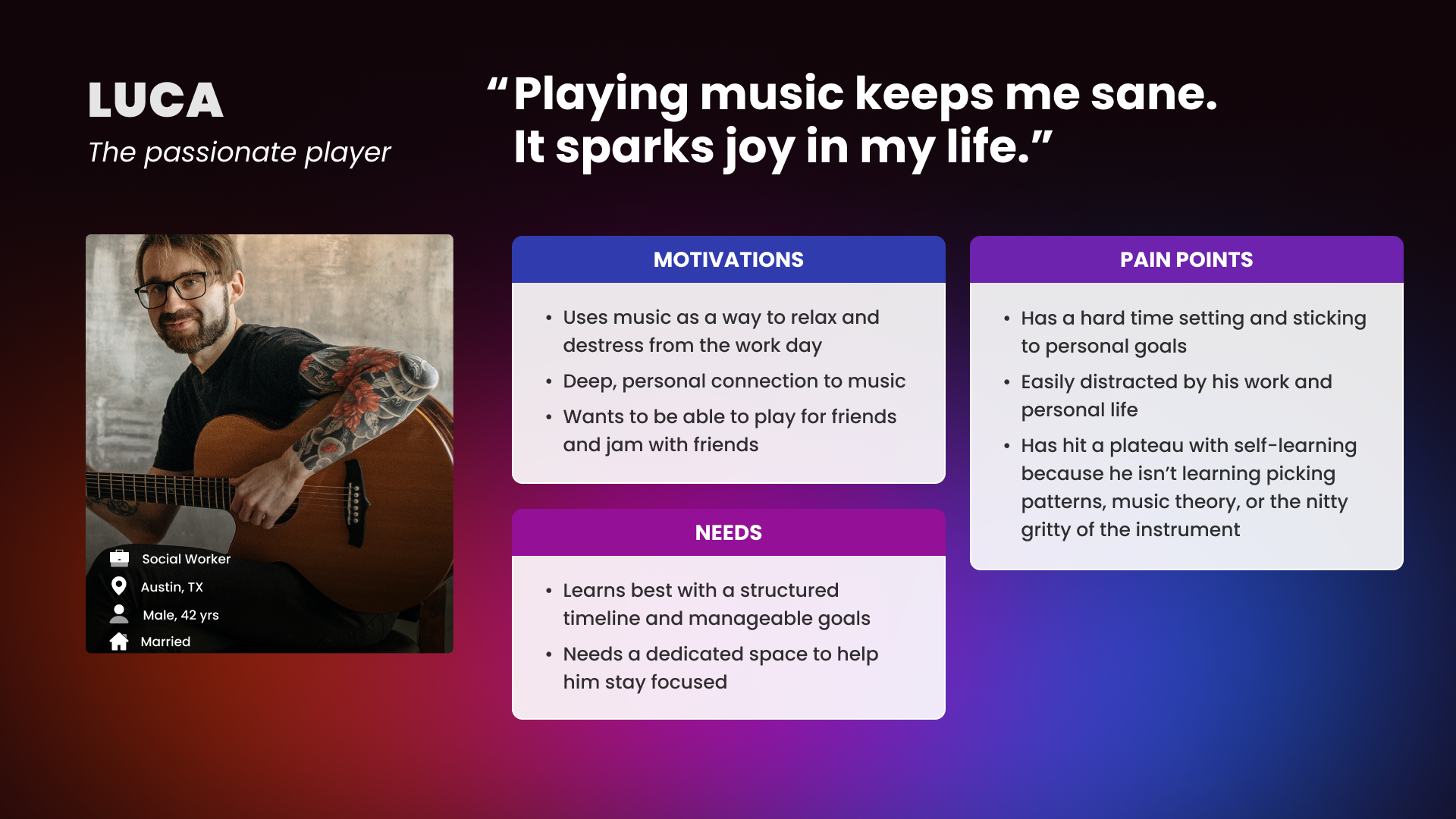
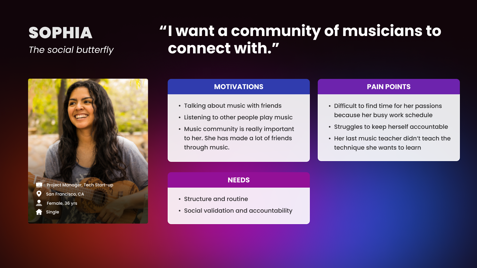
After synthesizing all the insights from the user interviews, I identified four key paint points:
1. Hard to find time to dedicate to their music because work and family takes priority
2. Difficult to hold themselves accountable without a teacher or a friend
After synthesizing all the insights from the user interviews, I identified four key paint points:
1. Hard to find time to dedicate to their music because work and family takes priority
2. Difficult to hold themselves accountable without a teacher or a friend
I decided to focus on the second area and explore ways to help music enthusiasts find a community of music-loving people to build social accountability and motivation. I created two personas to help guide my decision-making and stay focused on building the best solution for the users and their specific pain points.
With these personas in mind, I moved into the ideation phase to identify what product would best help Sophia and Luca stay motivated to continue playing and learning their musical instruments. I came up with tons of ideas, from a website that gamifies learning progress, to a site that uses AI to track performance. However, the yet-to-be-named app Delos was the clear winner for my 2 personas. I decided to create an app for socially-motivated music enthusiasts to help them find and connect with instructors and/or fellow music enthusiasts.


DESIGN GOALS:
• Provide a valuable experience that users wants to return to regularly
• Create a community of musicians where members feel inspired and motivated by one another
• Easily connect learners with their ideal music teacher
• Create a community of musicians where members feel inspired and motivated by one another
• Easily connect learners with their ideal music teacher
I started with task flows to help me visualized the user's experience. There are 3 key actions that I want the user to easily accomplish
MID-FIDELITY WIREFRAMES
Once I ironed out the task flows and had a plan for the app architecture, I put together mid-fidelity wireframes to test my design concepts and functionality without getting too caught up in detail
ITERATIONDuring stakeholder review, we identified a few areas of confusion on the Browse for Friends screen.
• The 2-column card design looked visually cluttered and might cause the user to feel overwhelmed by too many options.
• The horizontal scroll for the music style and goal tags was confusing and hid important information
• The bar graph for the user's skill level was not clear enough since each user might have a different idea of the scale. The visual representation of the skill may make beginners feel embarassed
• Updated the trim size to the proportions of a more modern phone
MODERATED USABILITY TEST
I evaluated users’ ability to accomplish main task flows and identify problem areas that arise as a result of the app’s architecture, interaction design, and visual design. The task flows included:
• Sign up for the app
• Connected with a musician and send them a message
• Schedule a lesson with an existing teacher
• Navigate to the newsfeed
• Sign up for the app
• Connected with a musician and send them a message
• Schedule a lesson with an existing teacher
• Navigate to the newsfeed
IDENTIFY PRIORITY CHANGES
After reviewing the priority matrix, we decided to prioritize the below changes for the MVP.
• Improve "Newsfeed" recall
• Clarify distinction between "Connect" and "Learn" sections
• Reduce friction found when scheduling a lesson
After reviewing the priority matrix, we decided to prioritize the below changes for the MVP.
• Improve "Newsfeed" recall
• Clarify distinction between "Connect" and "Learn" sections
• Reduce friction found when scheduling a lesson
IMPROVE NEWSFEED RECALL
During usability testing, some users found it difficult to recall where the newsfeed was. It took them a few tries before they clicked the logo in the top nav bar to bring them back to the home page/newsfeezd.
It was an obvious and easy fix to add the Newsfeed to the bottom navigation bar.
However, I also hypothesized that part of the issue was that after onboarding, the initial newsfeed didn't look enough like a newsfeed. So I removed the buttons describing different locations on the app.
To encourage recall, I changed the design to present as the users' first posts from Delos in their newsfeed.
CLARIFY "CONNECT" SECTION
Some users express found the circular highlight in the bottom navigation confusing, thinking it was a button. This was compounded by the use of the word "Connect" for both a navigation section and a button CTA.
For the MVP, I adjusted the navigation's click-state to look less like a button. I also moved the CTA buttons to the bottom of the screen so that they are closer to the user’s thumb when they are holding a phone
Lastly, I changed the name of the "Connect" and "Learn" sections in the bottom navigation. "Connect" became "Friends" making it more clear that this is a section dedicated to making social connections. "Learn" became "Teachers" to make it more clear that this is where users should go to find or schedule a lesson with a teacher.
REDUCE FRICTION FOUND WHEN SCHEDULING A LESSON
When asked to schedule a lesson with their teacher, all of the usability testers looked in the "events" section first. Did that mean we needed to rethink our entire site architecture?
Not at all! Sometimes, the solution is much easier than it seems. I hypothesized that the use of the calendar icon to represent events was causing scheduling users to associate that section more with any schedule action.
I changed the icon to a thunderbolt, suggesting live events, and tested the app with new users. It was a resounding success! After this small change, all of the users expected to schedule a lesson within the "Teachers" section.
I also improved the task flow for users with an existing teacher, adding a "Your Teacher" module to the top of the "Teacher" section.
NEXT STEPS
Since this app was created as a speculative project, I focused on the social and hobbyist persona. However, there would be a few more steps necessary before the app would be ready to pass over to development.
Most importantly, I would need to think through how user tasks will differ for Teachers. I would like to research the teacher persona more and test the app with teachers to ensure that our solution is optimized for both the learners and their teachers.
